Logo Design
As the Founder and Creative Director for Stretch Gallery, I took on the exciting challenge of bringing our unique vision to life. With a clear understanding of our mission, I started with the logo and branding. I wanted it to embody our commitment to fostering creative energy and reshaping the high-end art landscape. The design process was iterative, each version getting closer to encapsulating our brand's essence.


Logo Iterations & Final Design
Website & Catalogue
The website and catalogue were next. They needed to be visually striking yet user-friendly, showcasing our artists' work while providing all necessary details seamlessly. This balance of aesthetics and functionality carried over to our e-commerce listings on Artsy as well. - At the time of its publishing, the catalogue was interactive with rich html links embedded in the PDF that took the viewer directly to the artwork/artists corresponding Artsy page.
Marketing & Viewing Rooms
When it came to marketing, one of the unique tools I utilized was the Artsy Viewing Room function. These spaces were much more than just places to showcase art - they were platforms for deep, engaging storytelling about the artists and their work.
Each viewing room was curated with an individual artist in mind, and I crafted long-form narratives that delved into their creative process, inspirations, and artistic journey. This wasn't simply writing about art, it was about capturing the soul of the artist and making that connection with our audience.
The stories were just one part of the equation, though. I also needed to present the art in a way that was both visually compelling and in line with the narrative. To do this, I created fully-rendered, online-only showings for each viewing room.
These digital exhibits were designed to mimic the immersive experience of a physical gallery, allowing visitors to truly appreciate the art while deepening their understanding of the artist through the accompanying narratives. It was a blend of art, technology, and storytelling, aimed at creating a unique and impactful viewer experience.

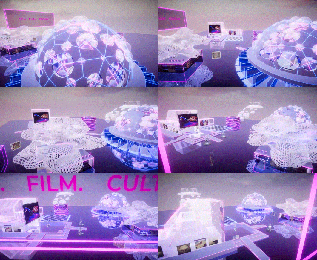
The Metaverse
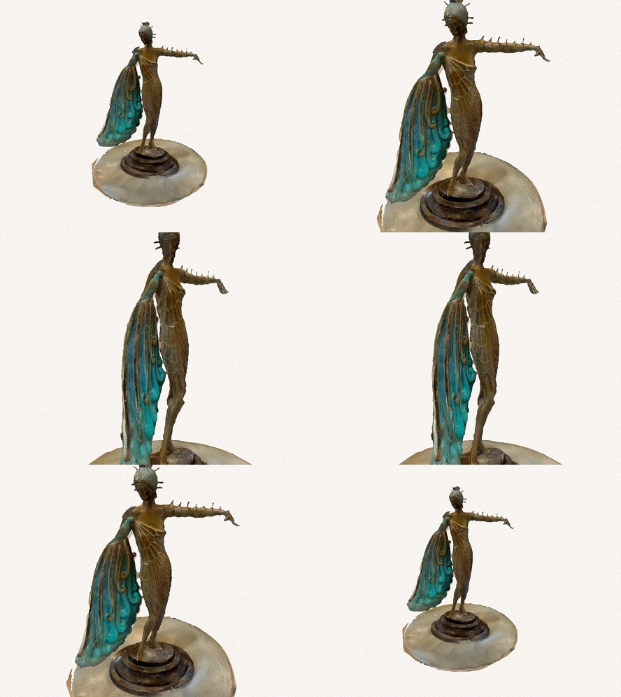
Creating the Metaverse space for Stretch Gallery was an amazing ride. Working with the brilliant folks at VoxBox, we dreamt up and brought to life a whole virtual art compound. It has three unique galleries, each showcasing a mix of NFTs and high-quality scans of physical art pieces.


What's cool is we were the first to show physical art in a digital space. This opened a new frontier, blending the hands-on beauty of traditional art with the limitless possibilities of the digital world. It was our way of saying that art can evolve, and Stretch is leading the way. It was a challenging yet rewarding journey, reshaping how art is viewed and appreciated.


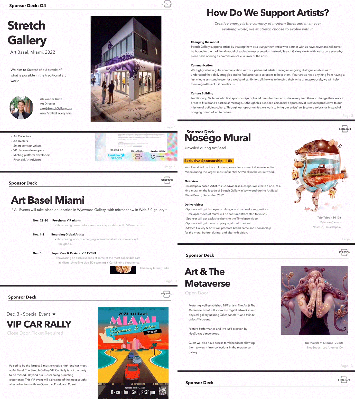
Sponsorship Decks
Finally, the sponsorships pitch decks. This was about telling our story compellingly to potential sponsors, highlighting our unique approach to art and culture. It was a balancing act of showcasing our achievements and painting a picture of our potential.

Throughout this project, the key was understanding that we weren't just selling art - we were building a culture, a community. It was about translating our mission into every design choice, creating a cohesive and impactful brand identity. The journey was both challenging and invigorating, truly stretching my creative limits.


